Brand overview
Eurasia Group is the leading global research and advisory firm. We live in an era of volatility and uncertainty, one that generates both risks and opportunities for businesses and investors. The Eurasia Group logo reflects this view by using the shape of our initials to symbolize a fragmented globe. We are committed to helping clients understand and navigate this changing geopolitical landscape and make better informed decisions in an uncertain world.
The idea of “politics first” is central to our work. Politics is the lens through which we view the world and the starting point for our interactions with clients. Much has changed as Eurasia Group has expanded, but the politics first approach—and the commitment to analysis that is free of political bias and the influence of private interests—has not.
This site is the enforceable source of truth for non‑designers and vendors producing EG materials.
Logo system
Use the primary logo wherever possible. Maintain clear space equal to half the logomark square on all sides. Minimum digital size: 24px height.
Approved logos
With/without tagline
Clear space & minimum size
Incorrect usage
Color system
Use high‑contrast pairings for text. Reserve cyan/gold/orange for accents and large display elements. Accessibility indicators are calculated for each swatch (text on white).
Primary palette
Extended palette
Extended colors support infographics, thematic emphasis, and event branding. Use sparingly; prefer Navy and Blues for core identity. Each swatch shows an accessibility check for small text on white.
Typography
Primary: Acumin Pro. Editorial accent: Source Serif. Microsoft fallback: Arial/Calibri.
| Role | Font | Weights | Notes |
|---|---|---|---|
| H1–H2 | Acumin Pro | Bold / Black | Tight letter‑spacing at large sizes |
| H3–H6 | Acumin Pro | Semibold / Bold | Use consistent scale |
| Body | Acumin Pro | Regular / Medium | 16–18px web, 1.5 line height |
| Editorial pull | Source Serif | Regular / Bold | Use sparingly |
| Office docs | Arial / Calibri | Regular / Bold | Fallback where licensing is limited |
Politics first: clear, direct, and legible. Headlines carry the story; body text supports with analysis.
Editorial pull quotes and long‑form accents pair with Acumin for a balanced, authoritative tone.
Note: To render Acumin Pro and Source Serif via Adobe Fonts, add your kit JS and map families to acumin-pro and source-serif-pro.
Charts & data visualization
Use standardized artboard sizes, font specs, and labeling rules. Colors follow the identity system above.
Standard sizes
| Context | Artboard | Export |
|---|---|---|
| Notes/web embed | Max width 650px | PNG 650px wide |
| Slide (half) | 650 × 650px | PNG 650px square |
| Slide (full) | 1300 × 650px | PNG 1300×650 |
Type specs
| Element | Spec |
|---|---|
| Title | Arial Bold 18pt (web equivalent 20–22px) |
| Subtitle / Unit | Arial Italic 16pt |
| Axis & Labels | Arial Regular 12–14pt |
| Source line | Arial Regular 10pt |
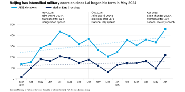
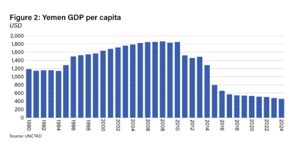
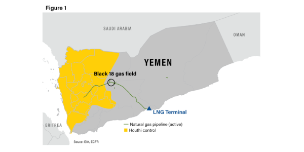
Examples
Labeling rules
- Titles are concise, left‑aligned, and descriptive.
- Always include unit labels and a clear source line.
- Axis labels in sentence case; avoid overcrowding ticks.
- Legends above or below the chart, not floating over data.