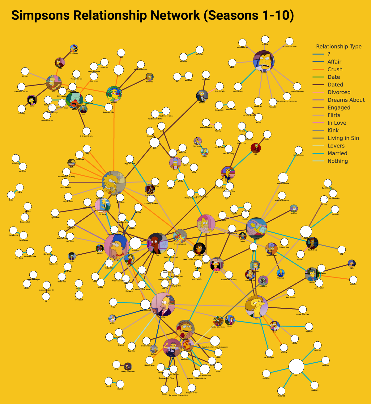
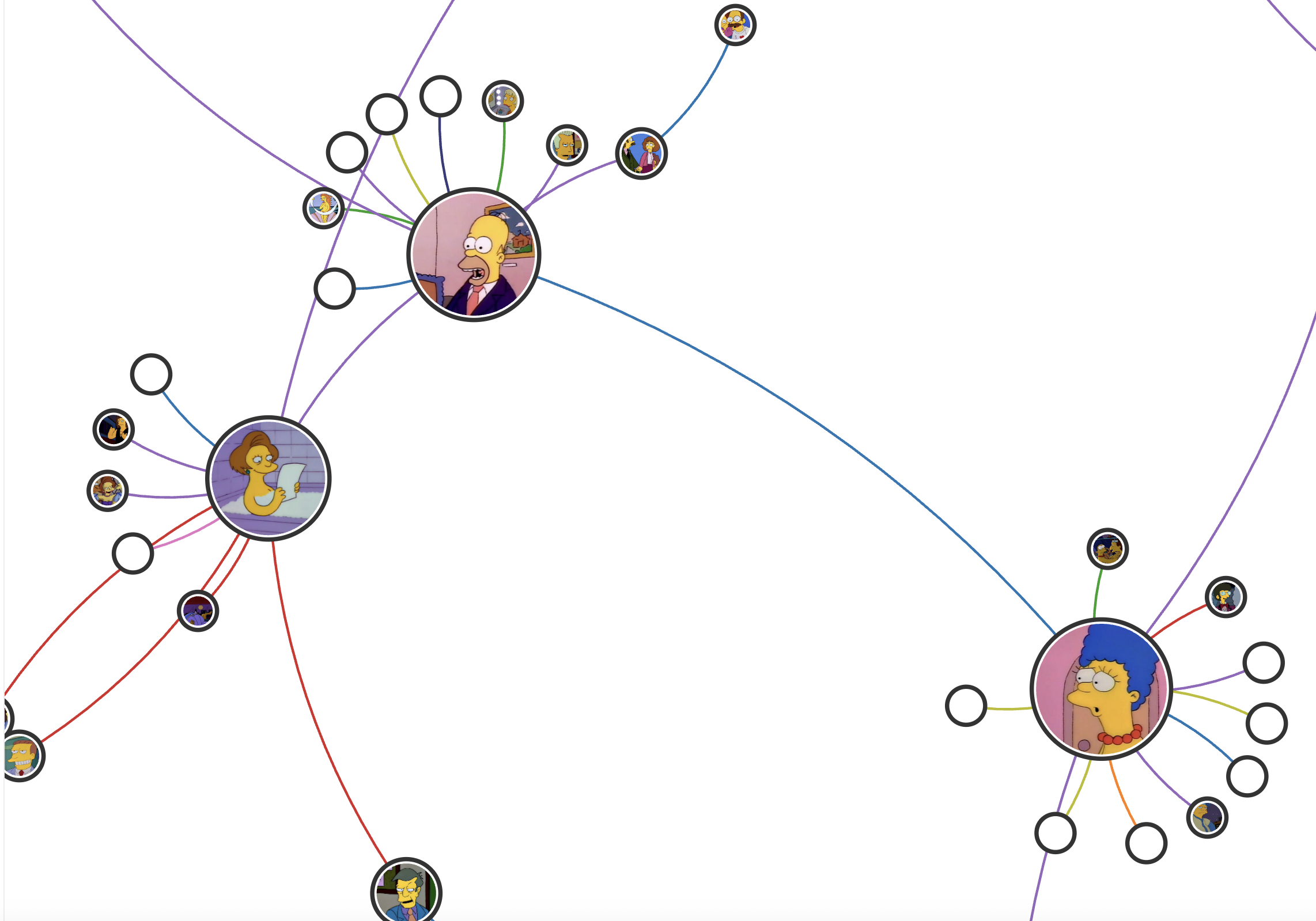
Simpsons Relationship Network (Seasons 1-10)
I’ve always been a big Simpsons fan, and somewhere between binge-watches I started collecting data. Along the way I saved charts from episodes, logged every food that made Homer drool, and sketched out Springfield’s surprisingly tangled web of relationships. One of the things I love is how a small town can feel like a whole world, full of overlapping marriages, crushes, and feuds. I usually make it about halfway through Season 11 before I circle back and restart, which means this archive is less about completion and more about enjoying the best seasons.
Launch Interactive Experience
Past approach
I always wanted to build this project as an interactive network. Back when I took a JavaScript class at General Assembly, this was my north star. My final project was a now-defunct table version of the dataset, where you could add new relationships and it would call the Frinkiac API to pull a random screenshot of the characters involved. It turned out that didn’t quite work—since when two people are together, they rarely say each other’s names. Still, it was a fun experiment and scratched the itch for a while. Since I don’t write JavaScript every day in my job, I never had the time to refine it into the interactive graph I imagined, but it’s the project that got me excited about bringing data, design, and coding together.
Vibe code approach
When GPT-5 came out, I started testing how far I could push it with design and coding requests. Earlier versions struggled with data parsing, so I gave it a dataset I knew inside out, my Simpsons relationships CSV, as a stress test. I told it which columns to ignore, defined the kind of network chart I wanted, and let it generate the first build. From there I iterated: adding photos, hiding names until clicked, creating a key, and debugging until the interactions felt smooth. The result is a project that’s part fandom, part design experiment, and a glimpse of how these new tools can support creative work.