The Graphic Truth
GZERO Media’s daily data-driven visual — a quick, sharp way to explain complex global stories through charts and infographics. Below are selected pieces and short notes on what I did to build them.

The NHL is no longer dominated by Canadians
This project began as a personal exploration into the history of the NHL, visualized through the nationalities of its players. The original chart, created over a decade ago, was a static look at how the league’s global footprint evolved.
In 2023, I revisited the project for GZERO Media. The updated version revealed an even more compelling story: Canada’s enduring dominance, the emergence and decline of hockey powerhouses, and the gradual internationalization of the game.
My role
I gathered and organized the underlying data, identified the key storylines, and designed the chart to balance clarity with depth. The first iteration was a static visualization; more recently, I developed an interactive version that allows readers to explore changes over time and uncover their own insights.
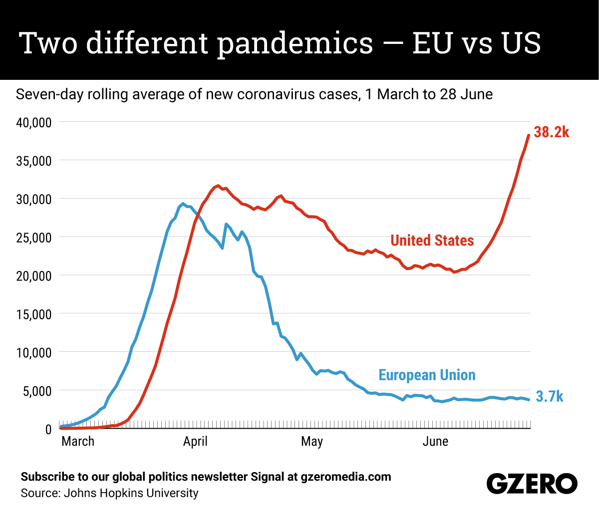
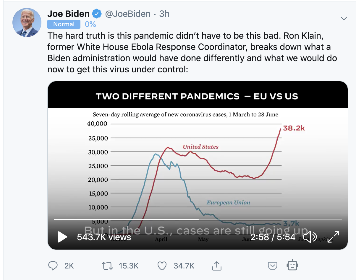
US vs. EU Pandemic Trajectories
Early in the pandemic, Ian Bremmer asked for a clear comparison of how the US and EU were managing Covid-19 for his weekly newsletter. I sourced data from the Johns Hopkins dashboard, ran the calculations, and built a simple line chart to track the diverging trends.
What seemed straightforward quickly became one of our most widely circulated visuals. The chart captured a critical moment — showing just how much worse the US outbreak was compared to Europe — and it resonated far beyond our audience. It even made its way into Biden’s 2020 campaign materials (European date stamps and all).
My role
Data sourcing · analysis · chart design
Impact
The chart became a viral reference point during the pandemic, demonstrating how even a simple, well-timed visualization can shape the conversation.
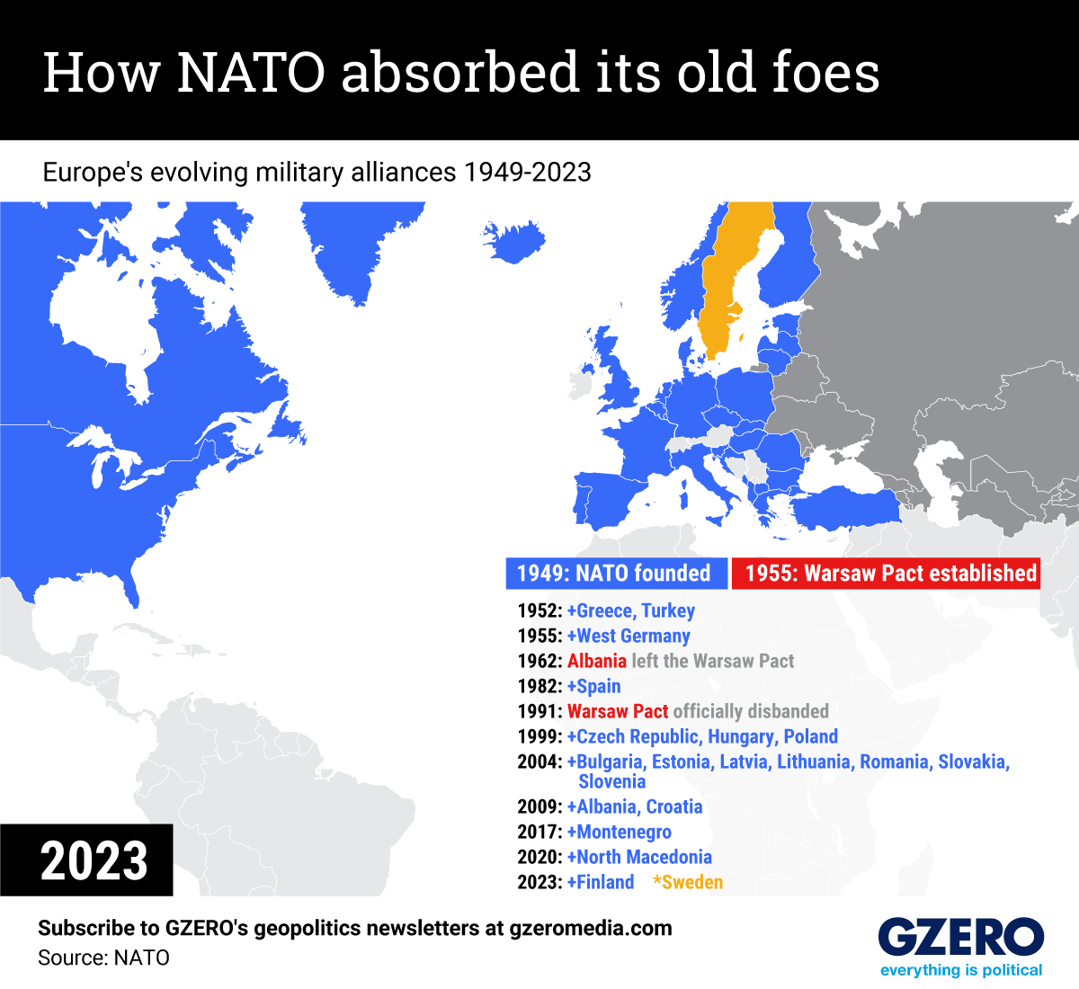
NATO Expansion Over Time
To highlight NATO’s growth since its founding, I worked with analysts who gathered the historical data on member states. My task was to transform that information into a clear, compelling visual.
I designed a map that layered historical and contemporary boundaries, showing when and how each country joined the alliance. To bring the story to life, I built an animated GIF using Illustrator and Photoshop — a simple, shareable format that made the expansion easy to grasp at a glance.
My role
Map design · asset preparation · animation
Impact
The animation distilled decades of geopolitical change into a format that was engaging for a wide audience, and it became a go-to visual for conversations around NATO’s evolving role.